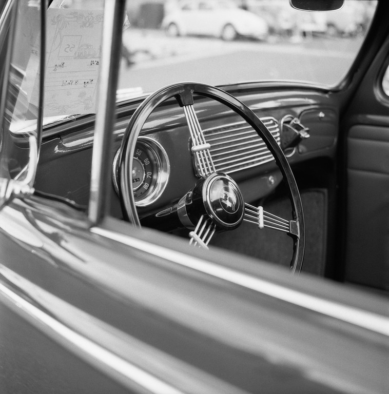
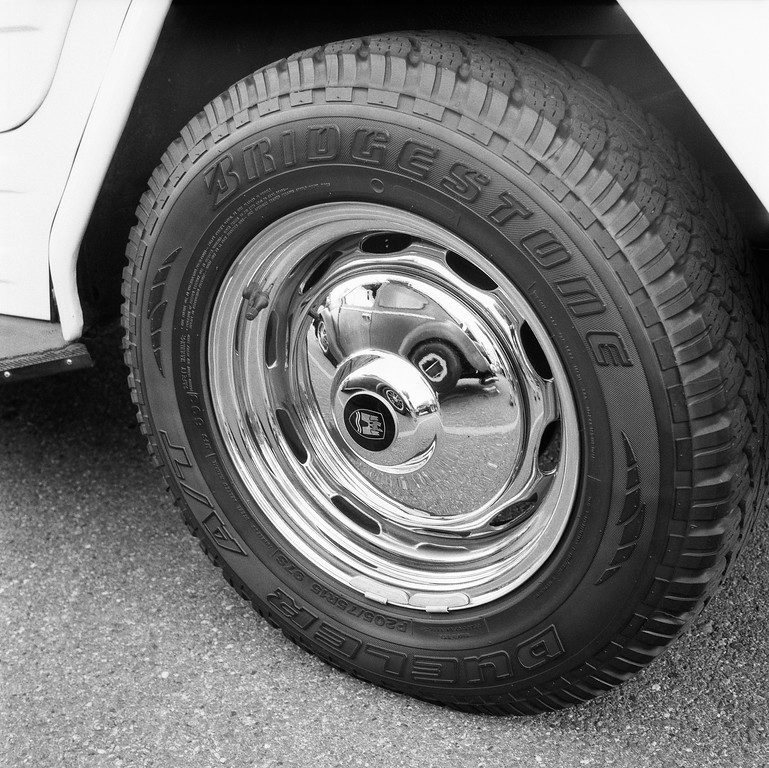
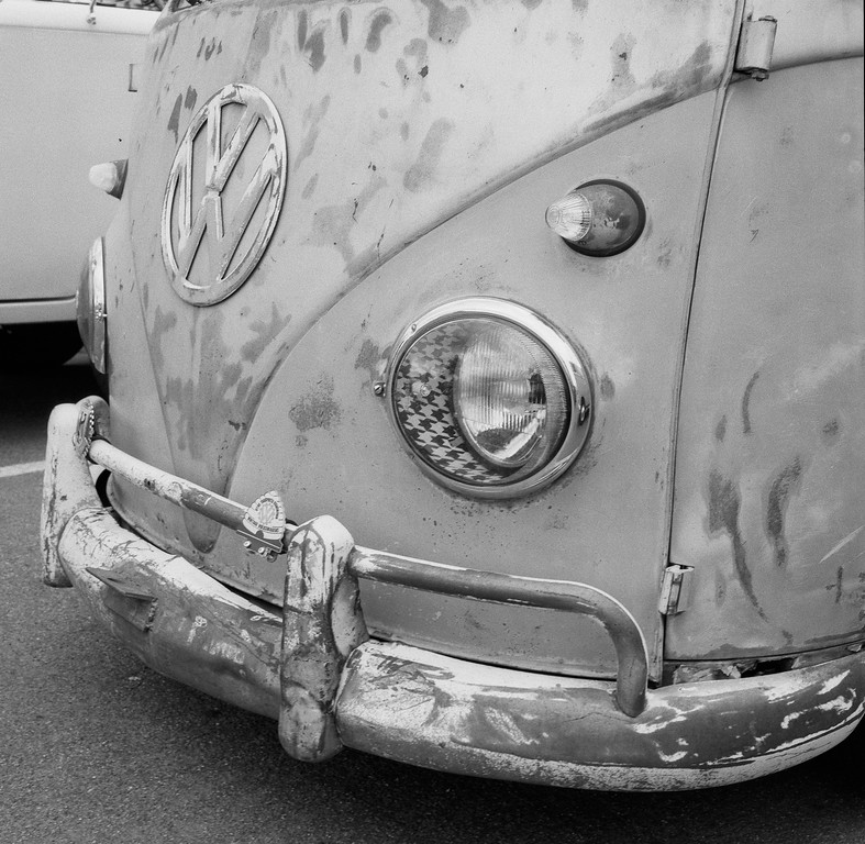
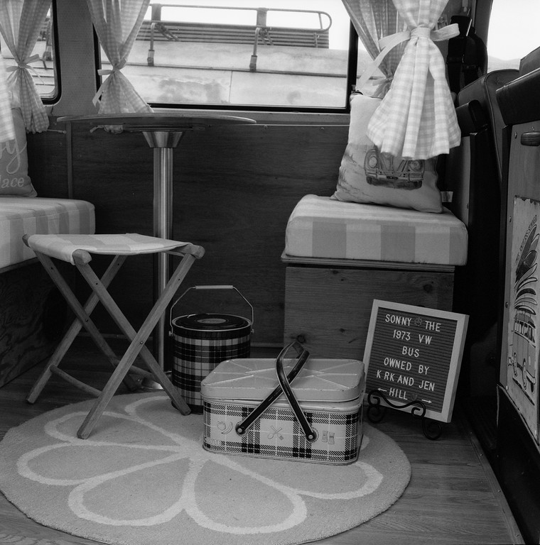
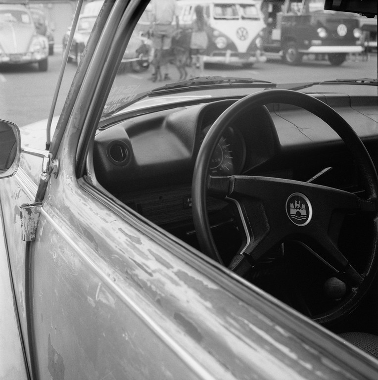
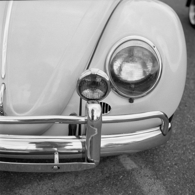
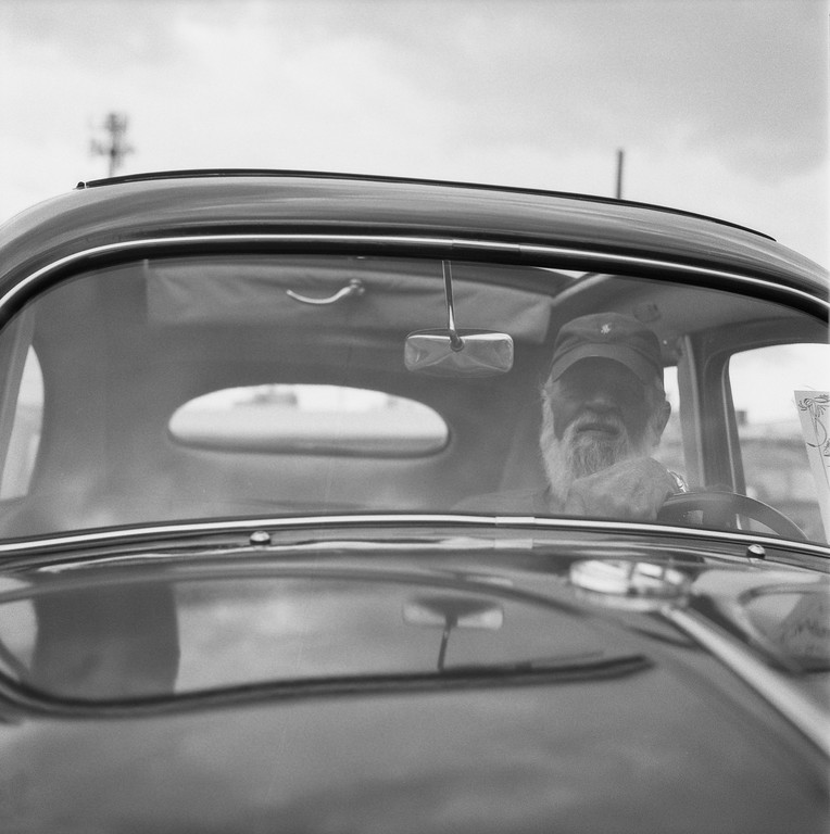
Since I was a kid, I’ve always loved Volkswagen Beetle’s. My parents often retell stories of me as a kid yelling “Volkswagen!” from the backseat of the car whenever I would see one. Sadly, I’ve never owned one. For me it has to do with not knowing which end of a screwdriver to use as I’m not mechanically inclined, or motivated. Regardless, they are fun cars to look at and photograph. One of my favorite local car shows each year is the No-Show Air-Cooled VW & Vintage Bicycle Gathering put on by the VooDoo Kruizerz in Kaysville, Utah.
In 2021, I decided to use my Yashica Mat-124 G and some CineStill BWXX 120 film. According to the CineStill website: [BWXX] has a variable base sensitivity of ISO 250 under daylight (5500K) and ISO 200 under tungsten (3200K) lighting conditions, and can be rated up to ISO 1600 with the appropriate processing compensation. Ideal for low light situations, this film delivers rich blacks and and wide range of tonal steps, while also providing very high sharpness, crisp micro-contrast, and a fine grain structure.
I shot both of my rolls at ISO 200 on a cloudy afternoon. The film delivered some very nice tones, contrasty (if that’s a word) blacks, and are very sharp. When I scanned these images, I removed a few specs of dust, lowered the brightness on a few, and that was it. Brightness to contrast was evenly balanced for most shots. I’m really pleased with how this film looks. After seeing the results, I went back and purchased more in 120 and 35. At $12.99 for a roll for 120 and $9.99 for 35 (36 exp), the 35 is a value for current film prices.
Camera: Yashica Mat-124 G (1970 – 1986)
Film: CineStill BWXX (Double-X)
Process: CineStill DF96 Monobath (3 Min @ 26° C)
Scanner: Epson V700 Photo


contrasty
kŏn′trăs″tē
adjective
Having or producing sharp contrasts between light and dark areas in photography.
Having great contrast between light and dark areas (of a subject or photograph)
having sharp differences between black and white
The American Heritage® Dictionary of the English Language, 5th Edition.
LikeLiked by 1 person
Thanks Maurice! 🙂
LikeLike
Some great shots there and the tones look really creamy. I always seem to end up shooting my Yashicamat 124G stopped down, forgetting just how great it can look when opened up to reduce the depth of field.
LikeLiked by 1 person